A preliminary investigation showed a project a colleague and I were considering probably isn’t worth doing. But for that investigation, I took a few hours to make a rather complicated plot using pylab, so I thought I’d share how I did that.
First, here’s the plot:
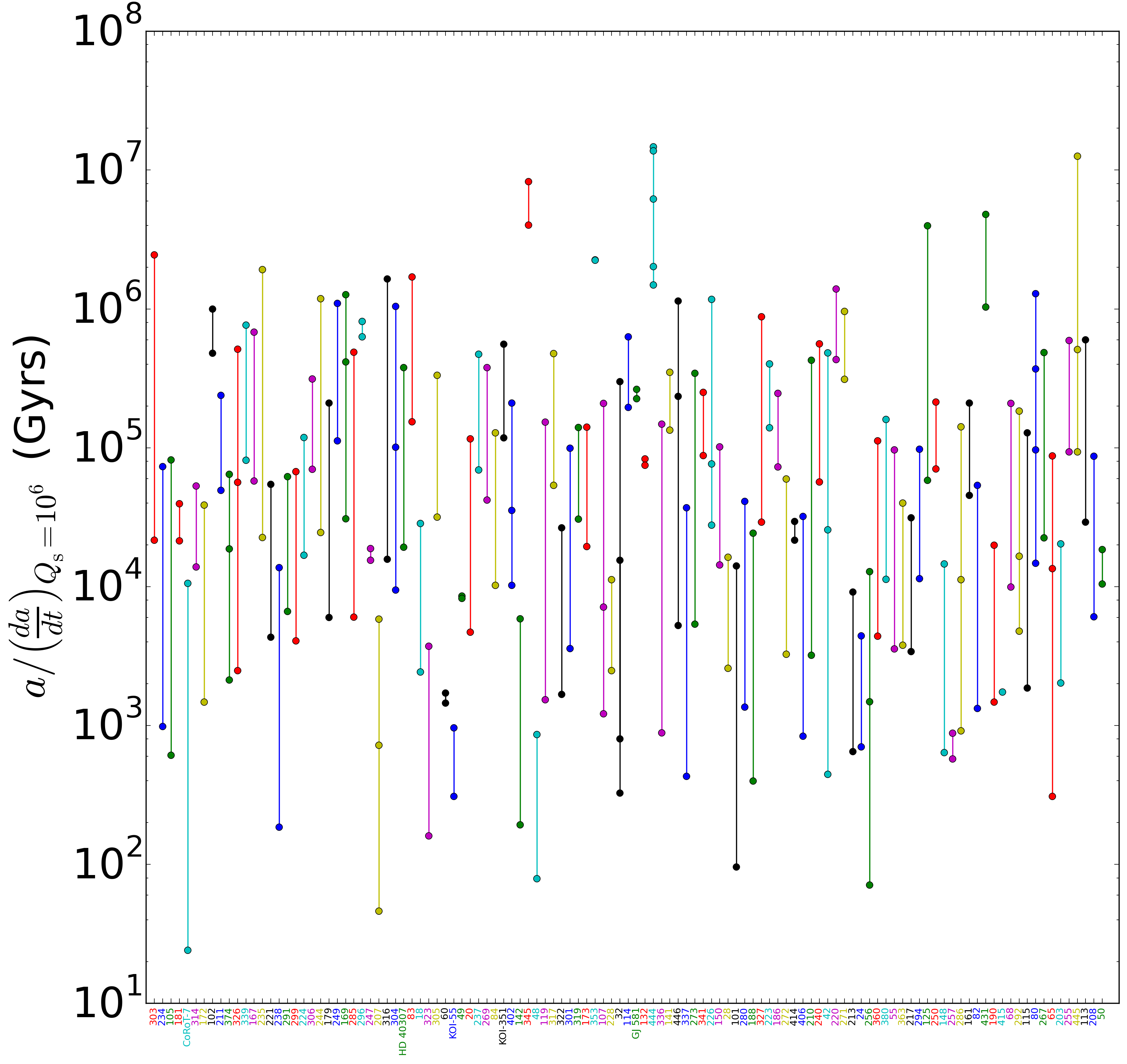
Tidal decay timescales for members of multi-planet systems.
The plot shows the timescales for tidal decay of members of multi-planet systems. Unfortunately, the x-axis labels aren’t legible unless you zoom in, but if you do, you can see the font colors match up with the corresponding line colors.
Below is the ipython notebook I used to generate the plot. The excel spreadsheet with the data is here.
#Show the plot inline
%matplotlib inline

#load in the required modules
import pandas as pd
import pylab as pl
import itertools as it
import numpy as np

# using the ExcelFile class
xls = pd.ExcelFile('exoplanet-archive_2015Mar25.xlsx')
data = xls.parse('obj of interest', index_col=1)
data = data[pd.notnull(data['a/(da/dt)Qs=1e6 (Gyrs)'])]

#Make a nice, big figure
fig = pl.figure(figsize=(15,15))
ax = fig.add_subplot(1, 1, 1)

#Make a list, indexing the dataframe labels
indices = range(len(set(data.index)))

#Make a list with the indices as the entries
labels = list(set(data.index))
#For concision, drop "Kepler" wherever it's found
labels = [w.replace('Kepler-', '') for w in labels]

#Make a cycle of line and text colors, blue, green, red, etc.
colors = it.cycle(['b', 'g', 'r', 'c', 'm', 'y', 'k'])

#Since each member of the multi-system should be plotted with the same x-value,
#  I need to generate a new list of all the same value with as many entries
#  as members. That's what "i" is for.
i = 0
for unq in set(data.index):

    #Retrieve the decay timescales calculated in the spreadsheet
    taus = data.loc[unq, 'a/(da/dt)Qs=1e6 (Gyrs)']

    #Generate the list of all the same x-value
    idx = np.ones_like(taus)*i

    #Make the scatter plot points with the current color
    ax.semilogy(idx, taus, marker='o', color=cur_color)


    #Get the next line color
    cur_color = next(colors)

    #Next x-value
    i += 1

#Give a little space to the left and right of the first and last x-values
pl.xlim([-1, len(set(data.index))+1])

#Switch out the x-values with the system names
pl.xticks(indices, labels, rotation='vertical', size='small', ha='center')

#Increase the size of the y-axis label font
pl.yticks(size=36)
#Label the y-axis
pl.ylabel('$a/\\left(\\frac{da}{dt}\\right)_{Q_{\\rm s} = 10^6}$ (Gyrs)', fontsize=36)

#Reset the colors cycle
colors = it.cycle(['b', 'g', 'r', 'c', 'm', 'y', 'k'])

#Set a new color for each x-axis label
for tick in ax.xaxis.get_ticklabels():
    tick.set_color(cur_color)
    cur_color = next(colors)

pl.savefig('Comparing multi-planet system a_dadt.png', bbox_inches='tight', orientation='landscape', dpi=250)