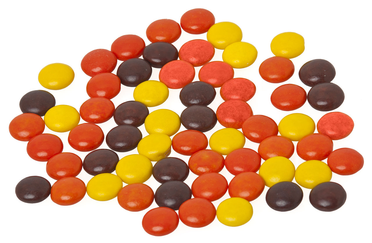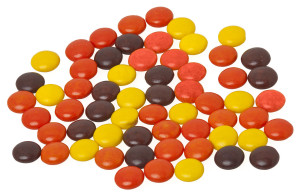
From http://en.wikipedia.org/wiki/Reese%27s_Pieces#/media/File:Reeses-pieces-loose.JPG.
I eat Reese’s pieces almost every day after lunch, and they come in three colors: orange, yellow, and brown.
I’ve wondered for a while whether the three colors occur in equal proportions, so for lunch today, I thought I’d try to infer the occurrence rates using Bayes’ Theorem.
Bayes’ Theorem provides a quantitative way to update your estimate of the probability for some event, given some new information. In math, the theorem looks like
$latex P\left( H | E \right) = \dfrac{ P\left( E | H \right) P\left( H \right)}{P\left( E \right)},$
The probability for event $latex H$ to happen, given that some condition $latex E$ is met, is the probability that $latex E$ is met, given that $latex H$ happened, times the probability for $latex H$ to happen at all, and divided by the probability for $latex E$ to be met at all.
The $latex P(H)$ and $latex P(E)$ are called the “priors” and often represent your initial estimates for the probability that $latex H$ and $latex E$ occur. $latex P\left(E | H \right)$ is called the “likelihood”, and $latex P(H | E)$ is the “posterior”, the thing we know AFTER $latex E$ is satisfied. $latex P(H | E)$ is usually the thing we’re trying to calculate.

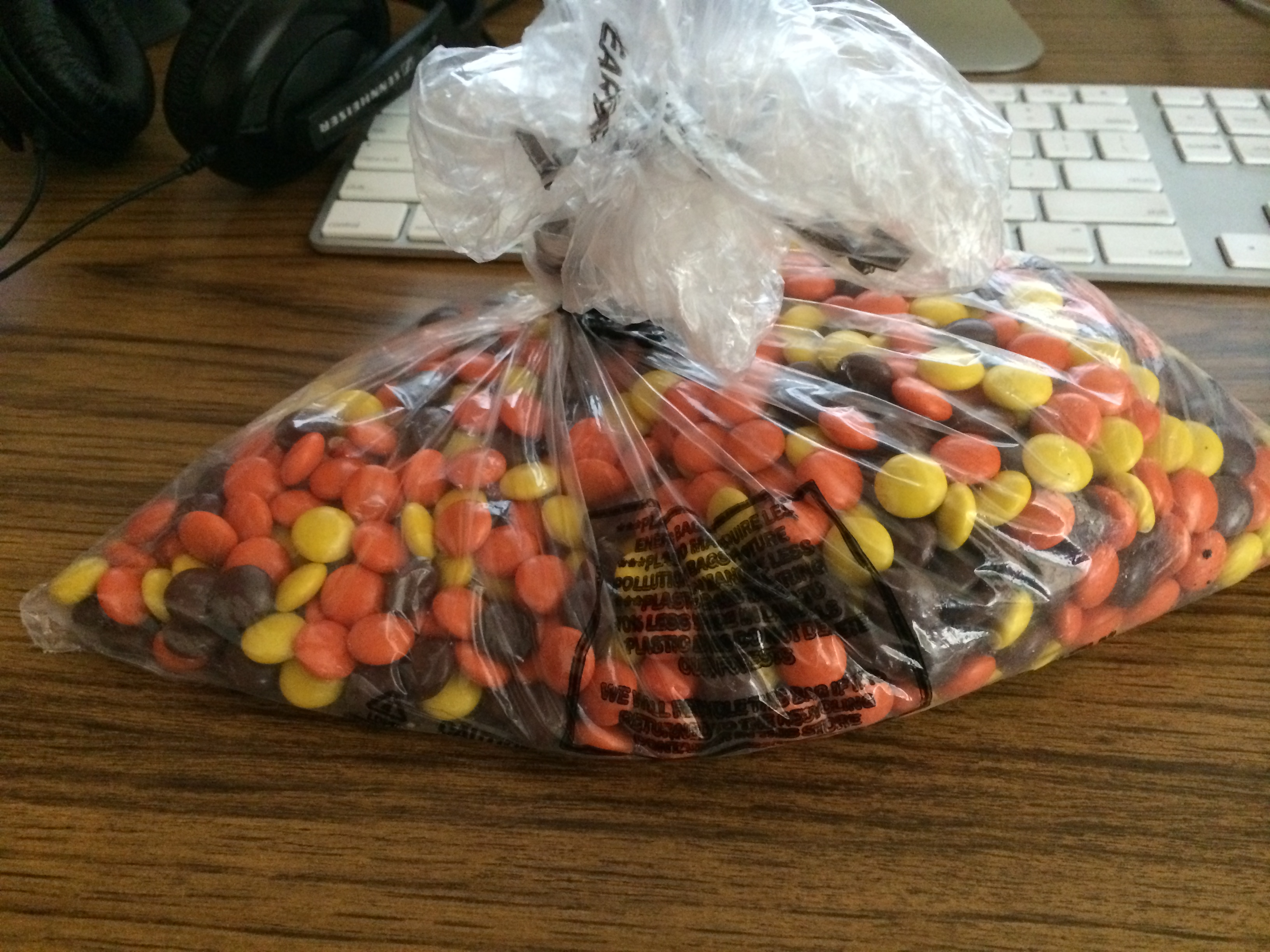
Thanks, Winco buy-in-bulk!
So for my case, $latex P(H)$ will be the frequency with which a certain color occurs, and $latex E$ will be my experimental data.
For a given frequency $latex f_{\rm orange}$ of oranges (or browns or yellows), the probability $latex P(f_{\rm orange} | E)$ that I draw $latex N_{\rm orange}$ oranges is ~ f^N (1 – f)^N(not orange). As I select more and more candies, I can keep re-evaluating $latex P$ for the whole allowed range of f (0 to 1) and find the value that maximizes $latex P$.
Closing my eyes, I pulled ten different candies out of the bag, with following results in sequence: brown, orange, orange, yellow, orange, orange, orange, brown, orange, yellow, orange. These results obviously suggest orange has a higher frequency than yellow or brown.
This ipython notebook implements the calculation I described, and the plots below show how $latex P$ changes after a certain number of trials $latex n_{\rm trials}$:
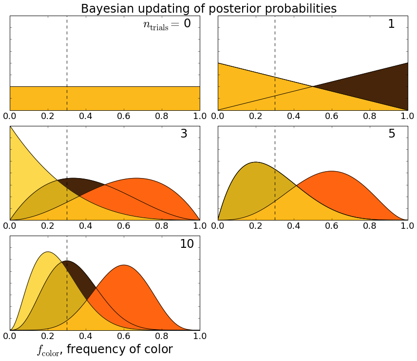
Applying Bayesian inference to determine the frequency of Reese’s pieces colors.
So, for example, before I did any trials $latex n_{\rm trials} = 0$, I assumed all colors were equally likely. After the first trial when I chose a brown candy, the probability that brown has a higher frequency than the other colors goes up. After three trials (brown, orange, orange), orange takes the lead, and since I hadn’t seen any yellows, there’s a non-zero probability that yellow’s frequency is actually zero. We can see how the probabilities settle down after ten trials.
Based on this admittedly simple experiment, it seems that oranges have a frequency about twice that of yellows and browns. Although not as much fun, if I’d bothered to check wikipedia, I would have seen that “The goal color distribution is 50% orange, 25% brown, and 25% yellow” — totally consistent with my estimate.